Lazy Donut
Overview
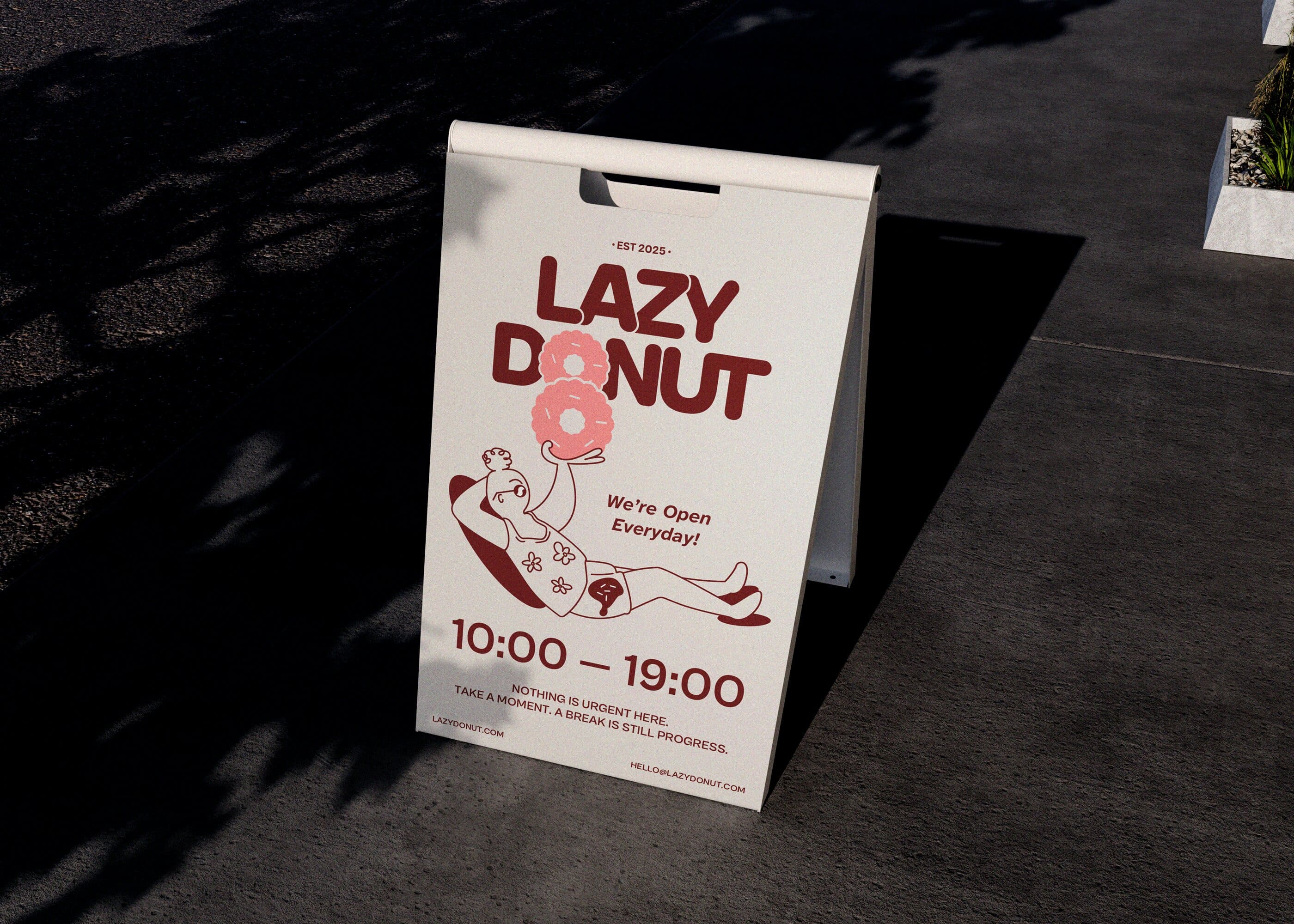
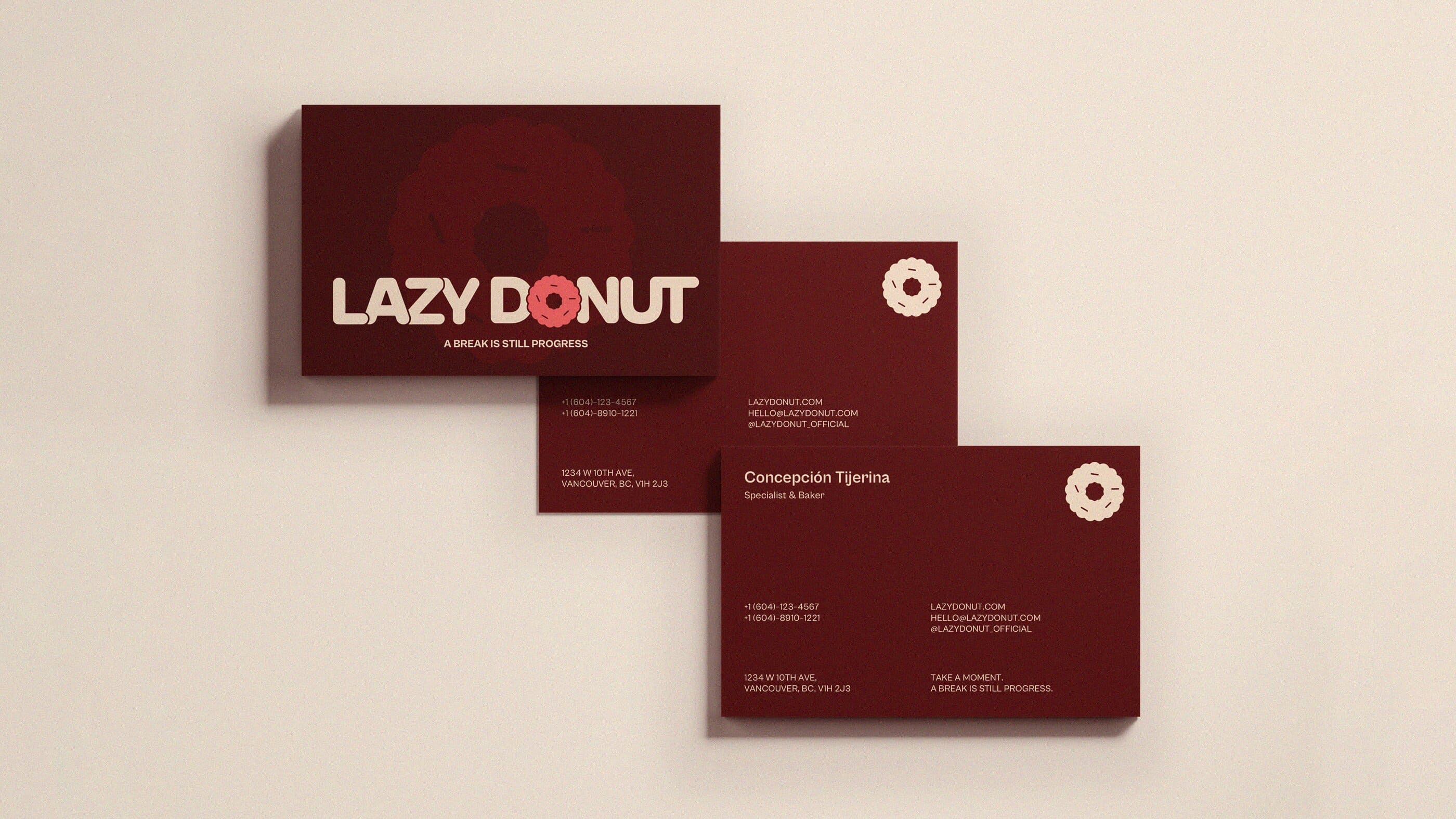
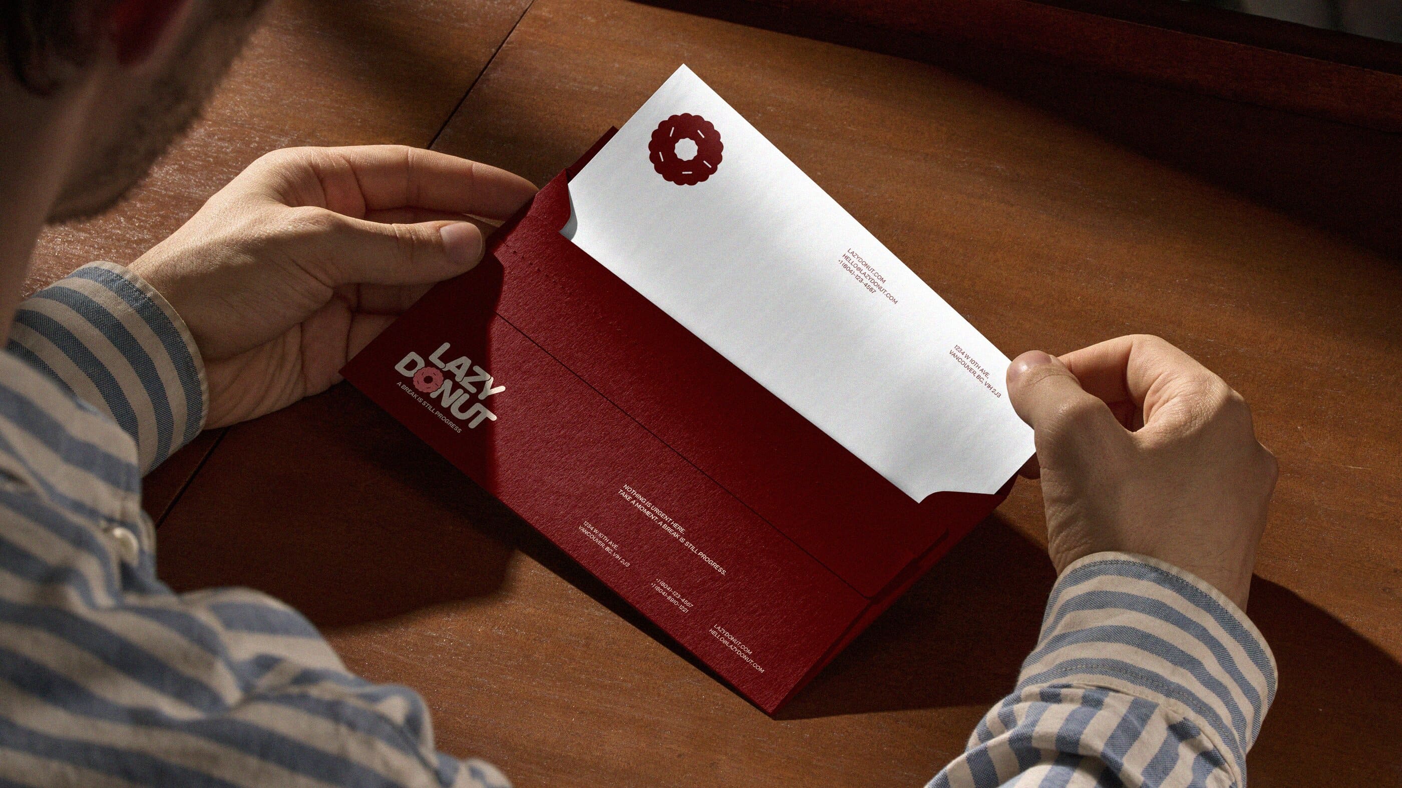
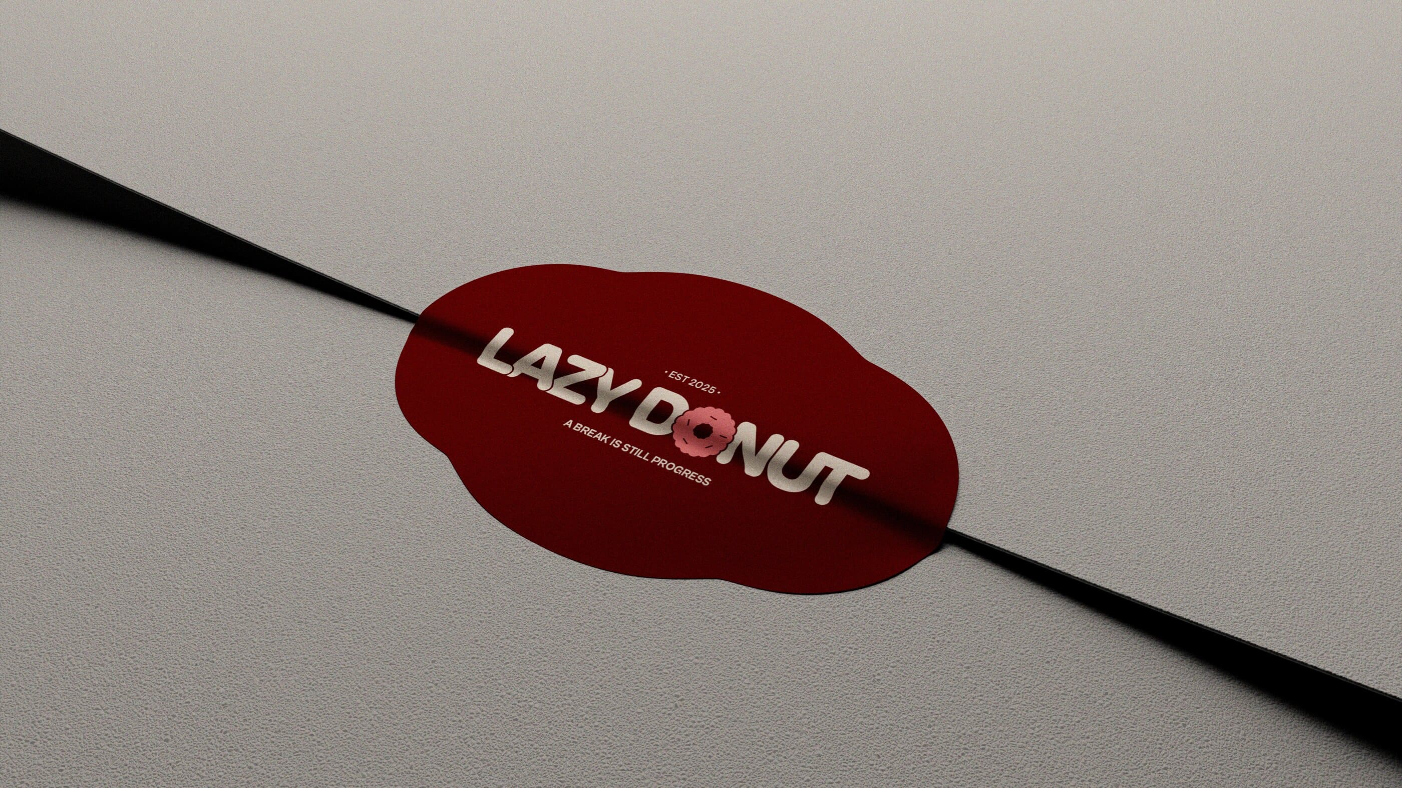
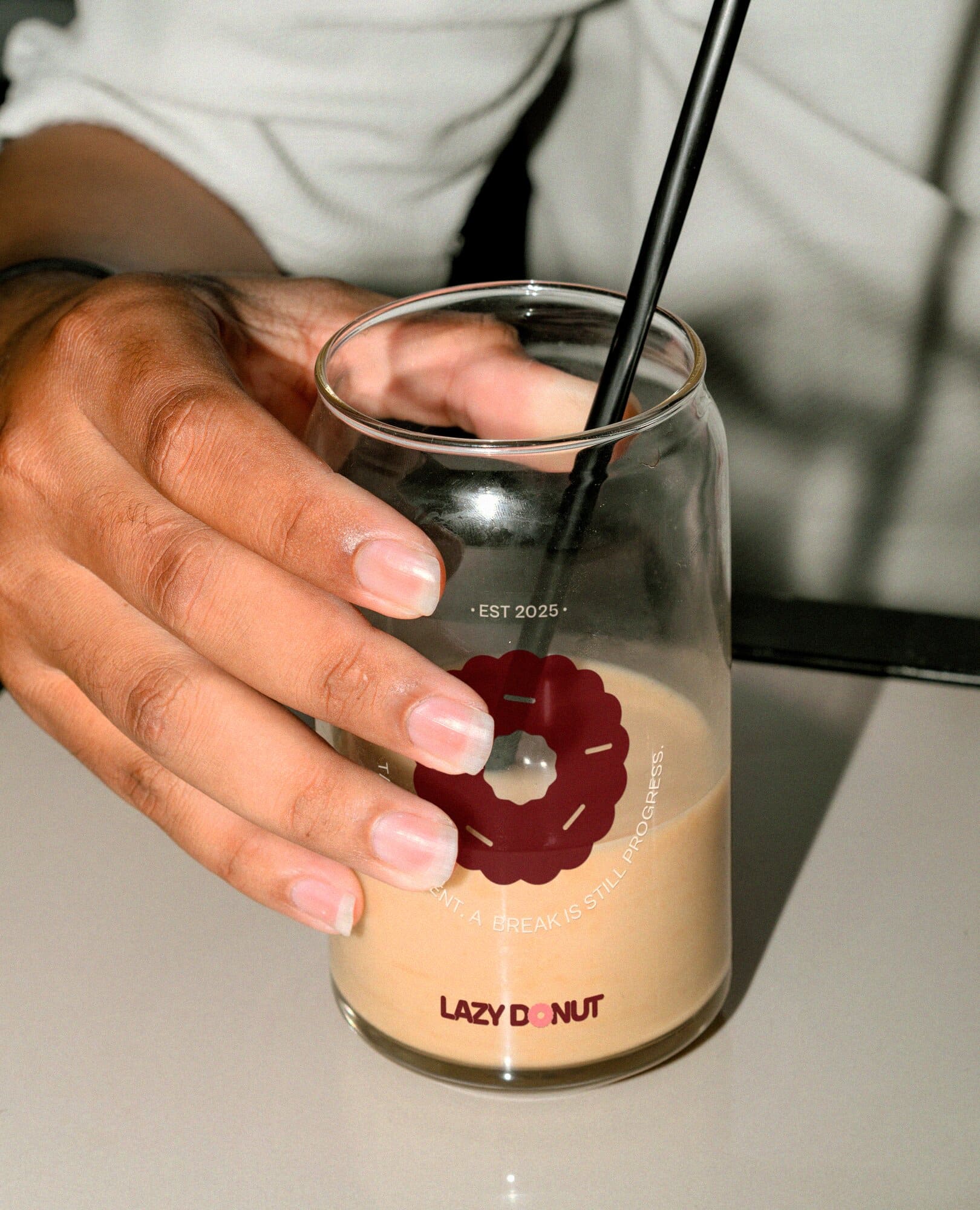
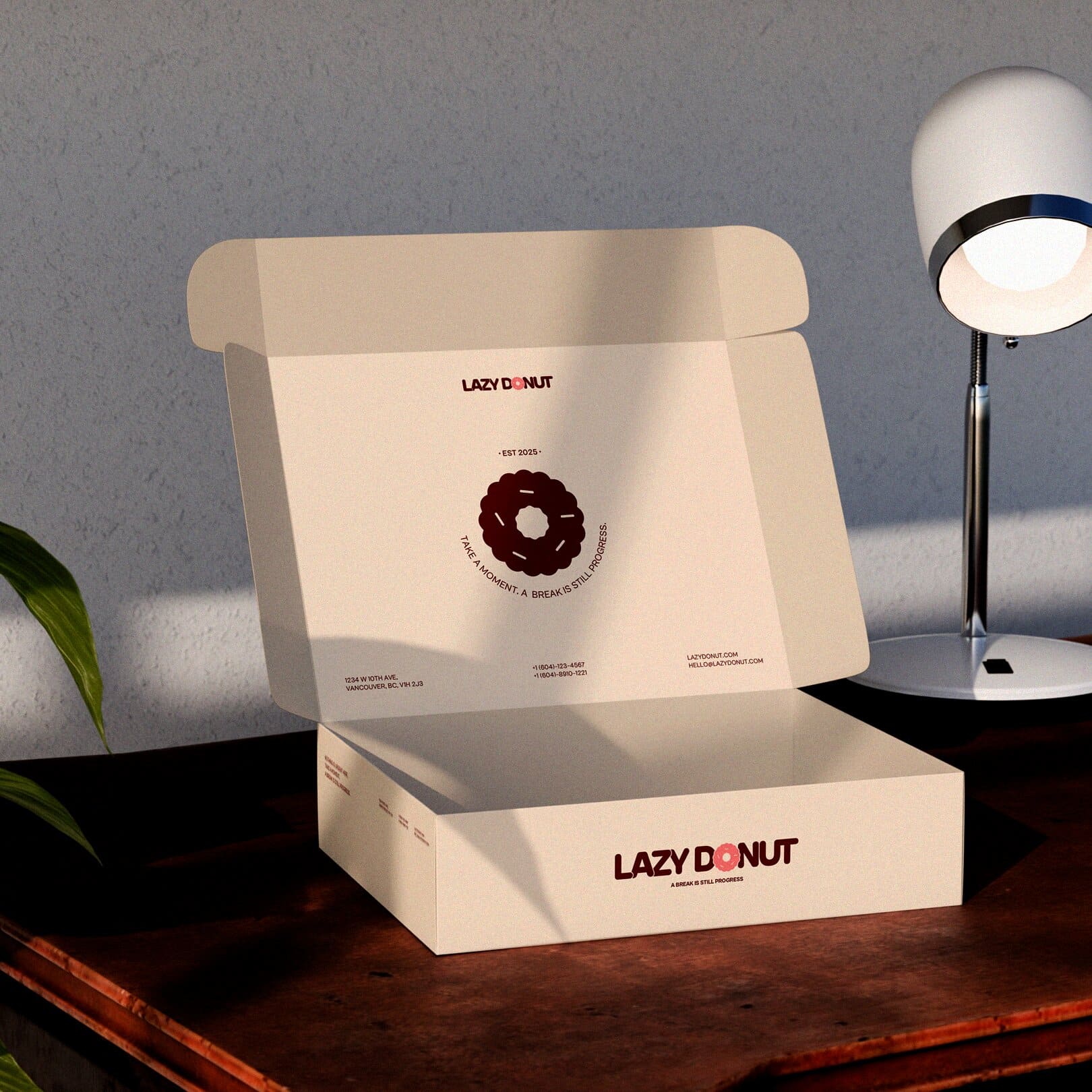
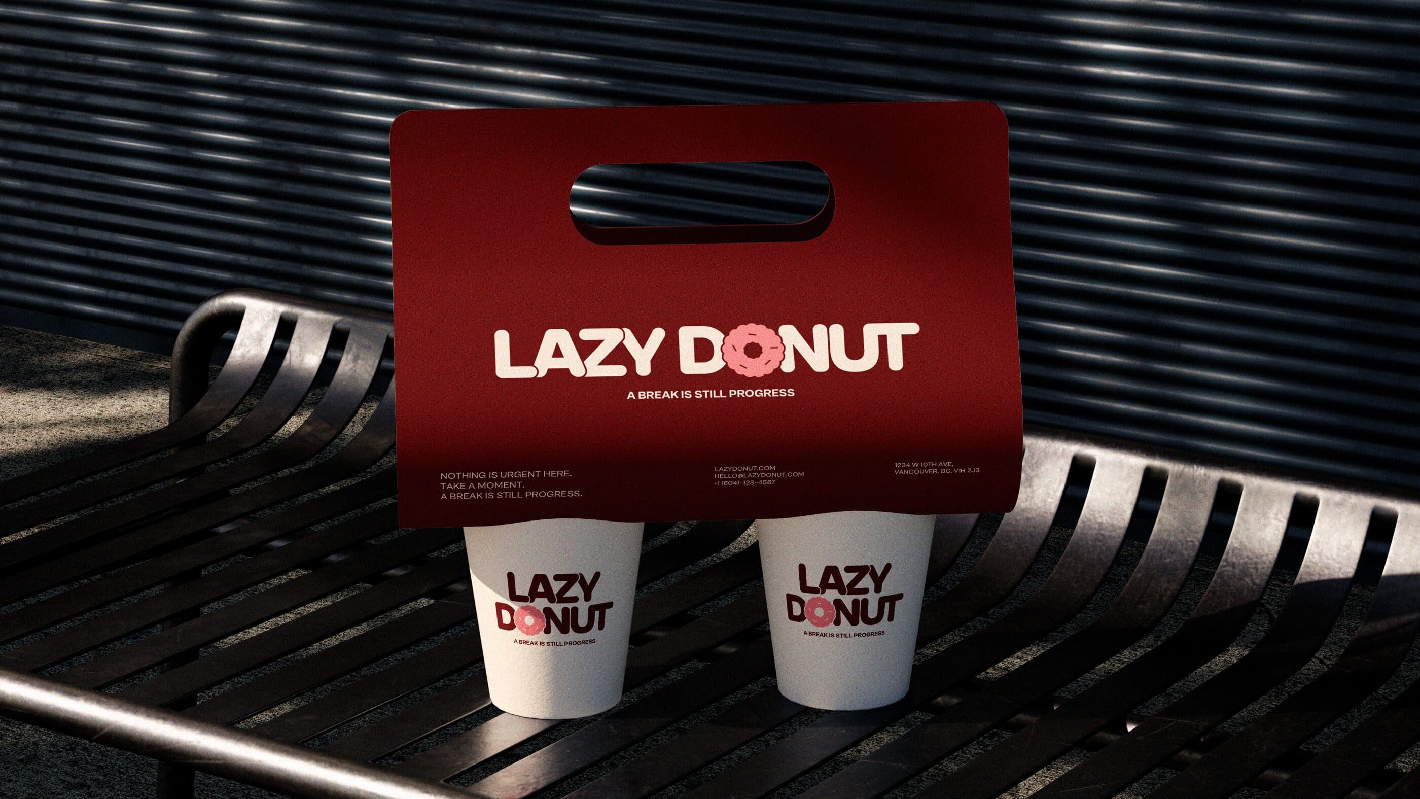
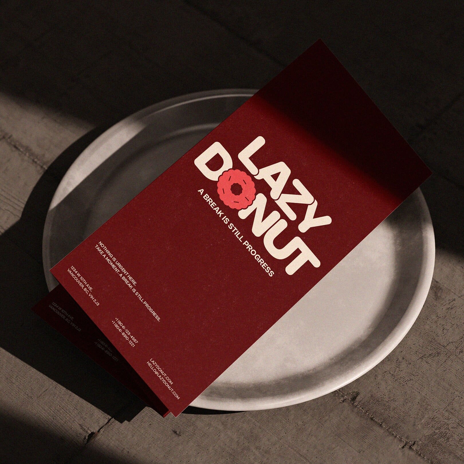
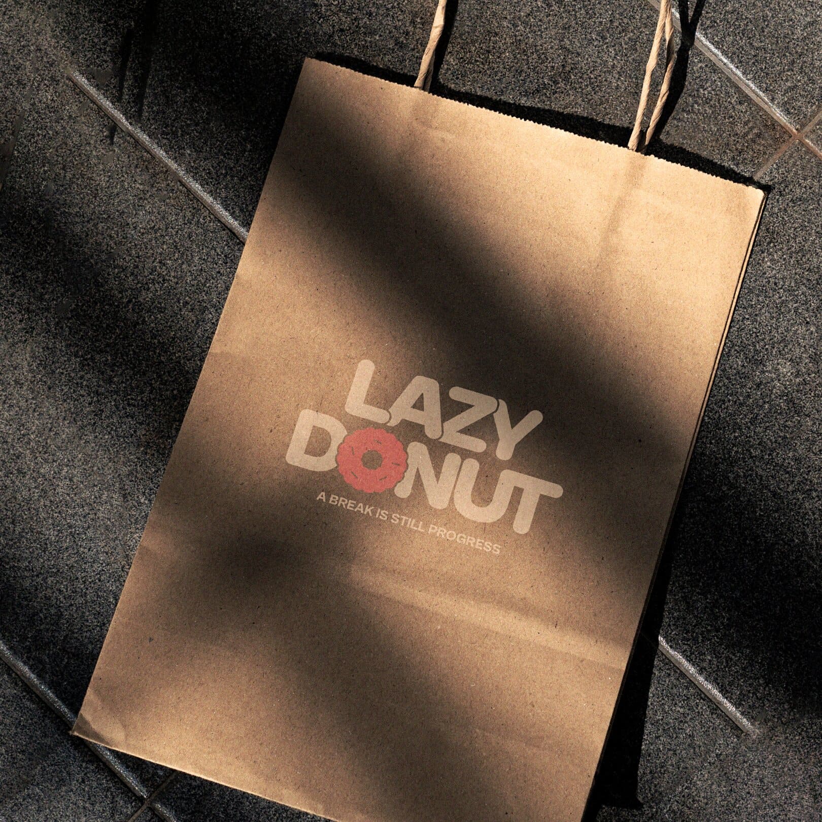
A break is still a progress.
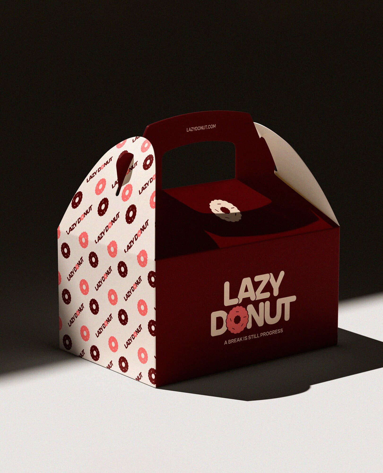
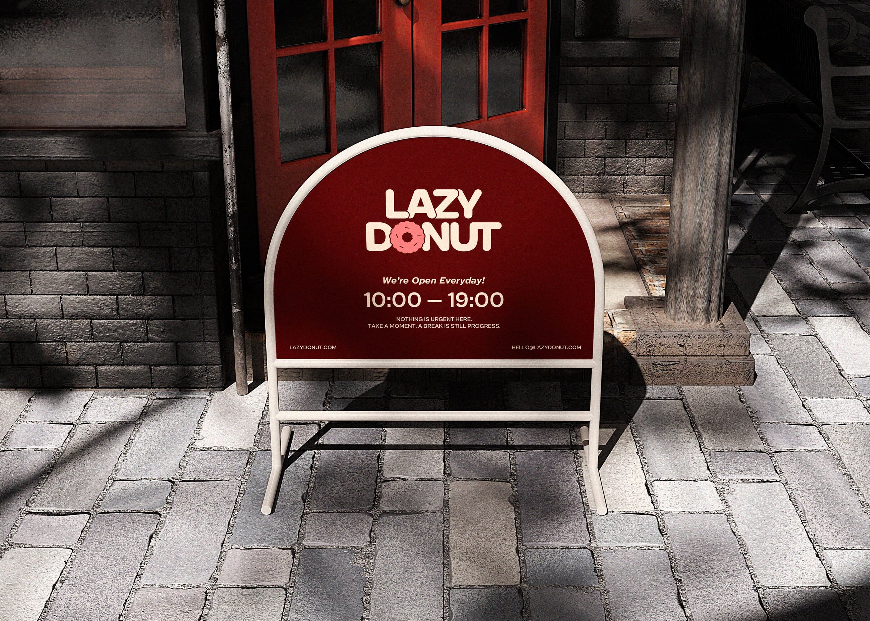
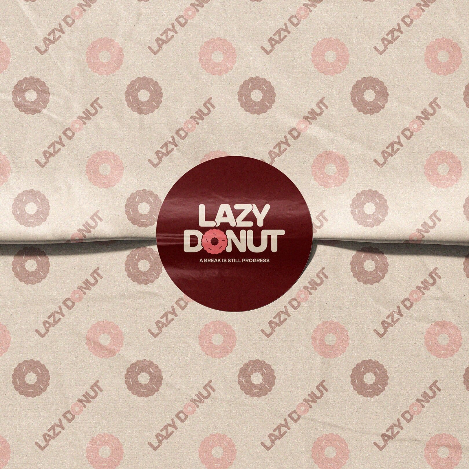
Lazy Donut is a donut brand designed for busy students and workers who struggle to take breaks. It reframes rest as a necessary part of productivity, encouraging people to pause without guilt. Through a light, friendly tone and approachable visuals, the brand communicates that a break is still progress.
Year
December 2025
Duration
8 Weeks
Type
Branding
Role
- Branding Designer
Tools Used
- Procreate
- Adobe Photoshop
- Adobe Illustrator
- Adobe InDesign
I developed a brand identity that reflects Lazy Donut’s ethos of guilt-free rest. It focused on defining a clear brand direction, including visual identity, tone of voice, and audience alignment, to create a cohesive and intentional experience.
Challenges
It was significant to balance a casual, friendly tone with a meaningful message about rest. The brand needed to feel approachable while still communicating a clear perspective on productivity and breaks. This required defining how relaxed the brand should appear, shaping a consistent tone of voice, and establishing a visual language that reflects softness and ease. Colour, typography, and illustration played a key role in expressing these qualities. Thus, it was important to build a cohesive identity system through a considered combination of colour palettes, type, and character-based illustrations, allowing the brand to communicate quickly and effectively.
Approach & Key Process
Brand Study
Audience Understanding
Category Exploration
Concept Foundation
Concept Development
Brand Positioning
Naming Context
Identity System Design
Logo & Mark
Visual Language
Graphic Elements
Applications
Brand System Finalization
Mockups & Applications
Final Presentation
Solution
I begand the project by defining Lazy Donut’s visual and verbal direction through illustration, colour, and typography.
This approach established a cohesive system that aligns with the brand’s positioning while remaining appropriate within
the category.
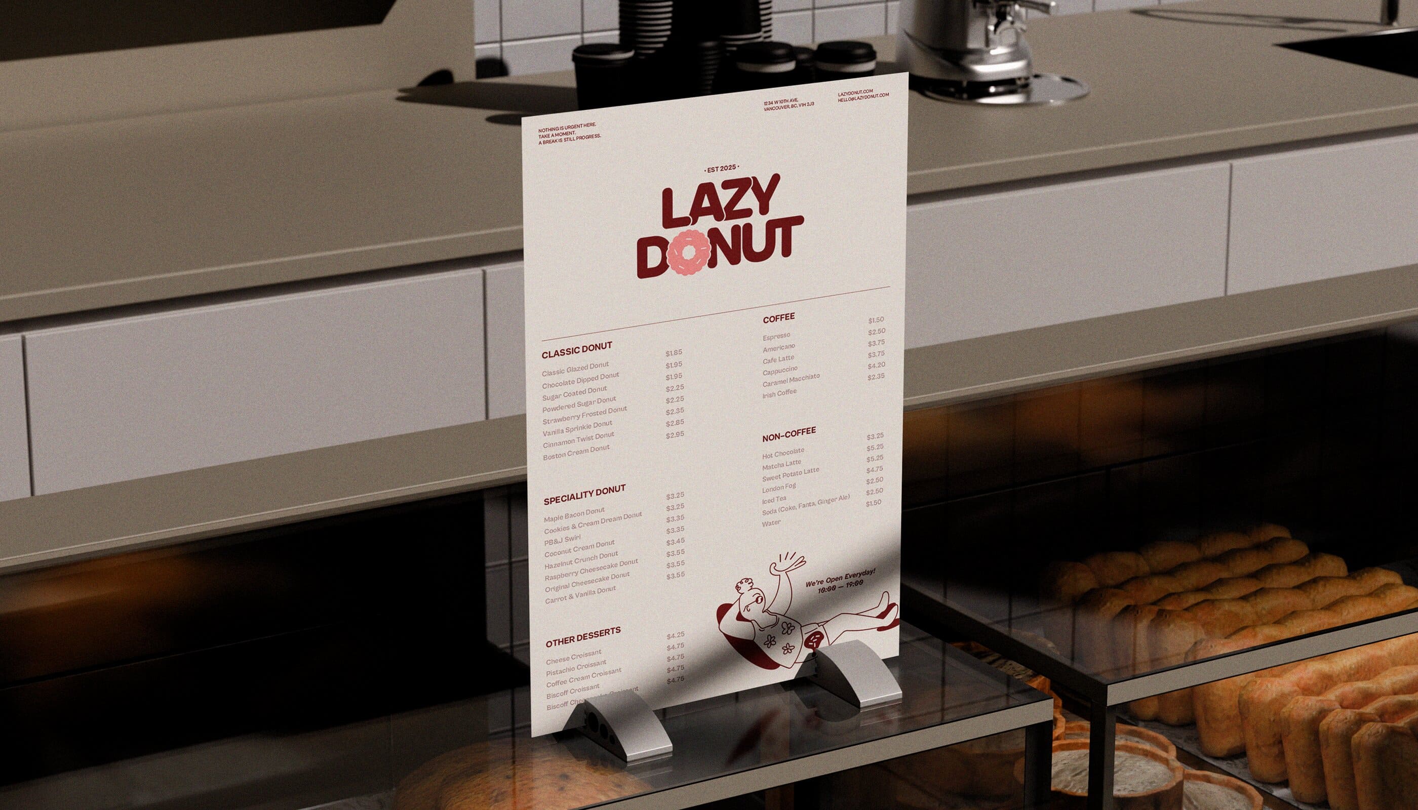
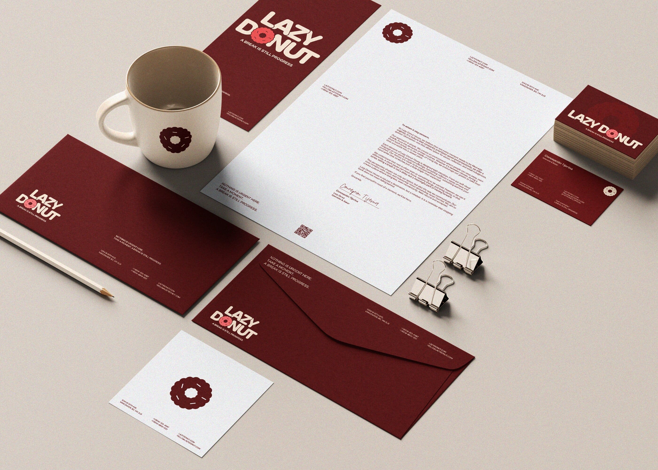
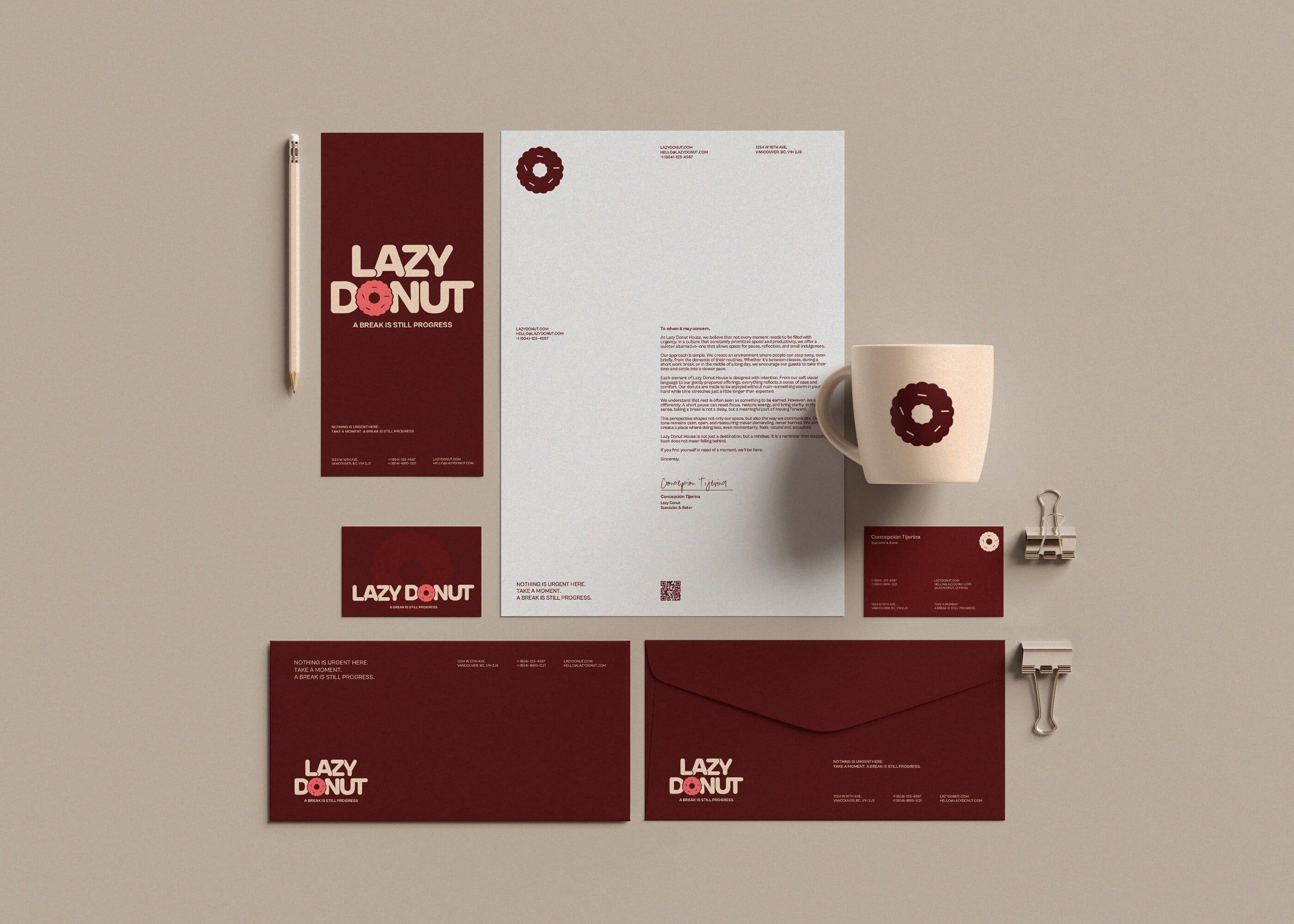
Focusing on the message of encouraging busy students and workers to take a break, the identity was built around both
product and human elements. A soft, imperfect donut form represents the core of the brand, while relaxed human figures
holding donuts introduce warmth and a sense of relatability.
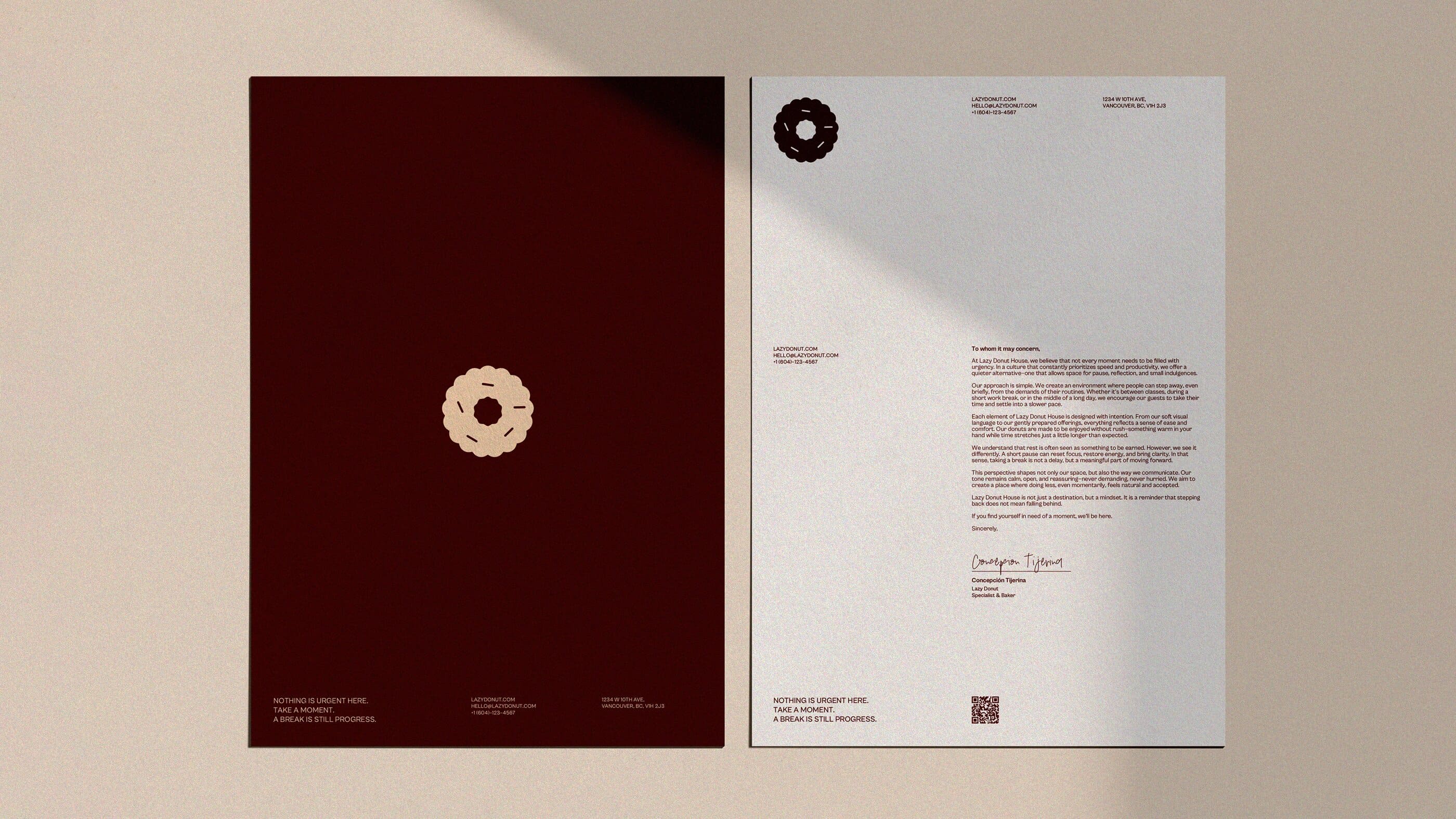
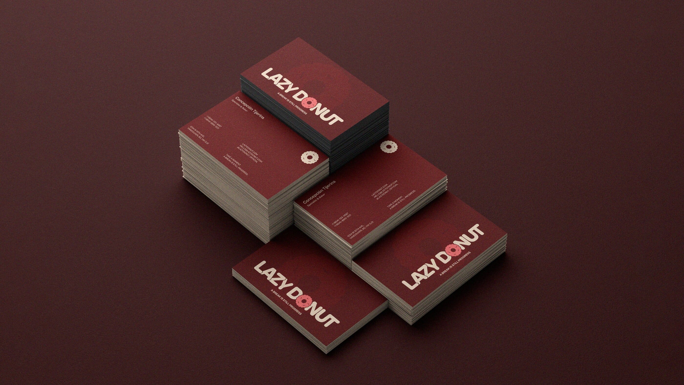
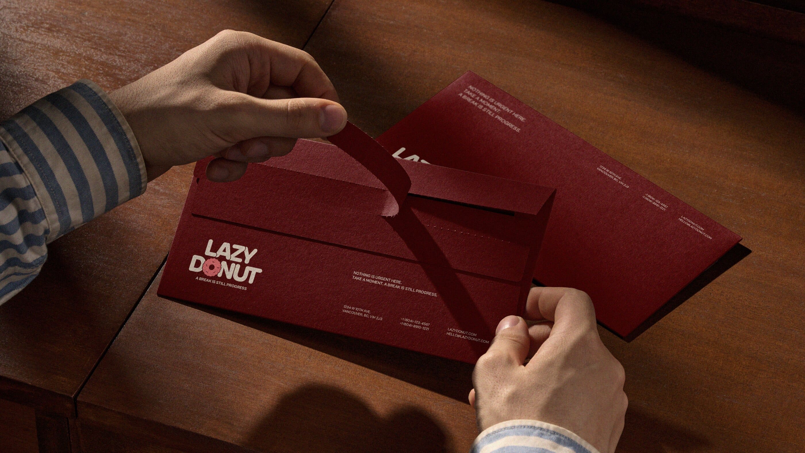
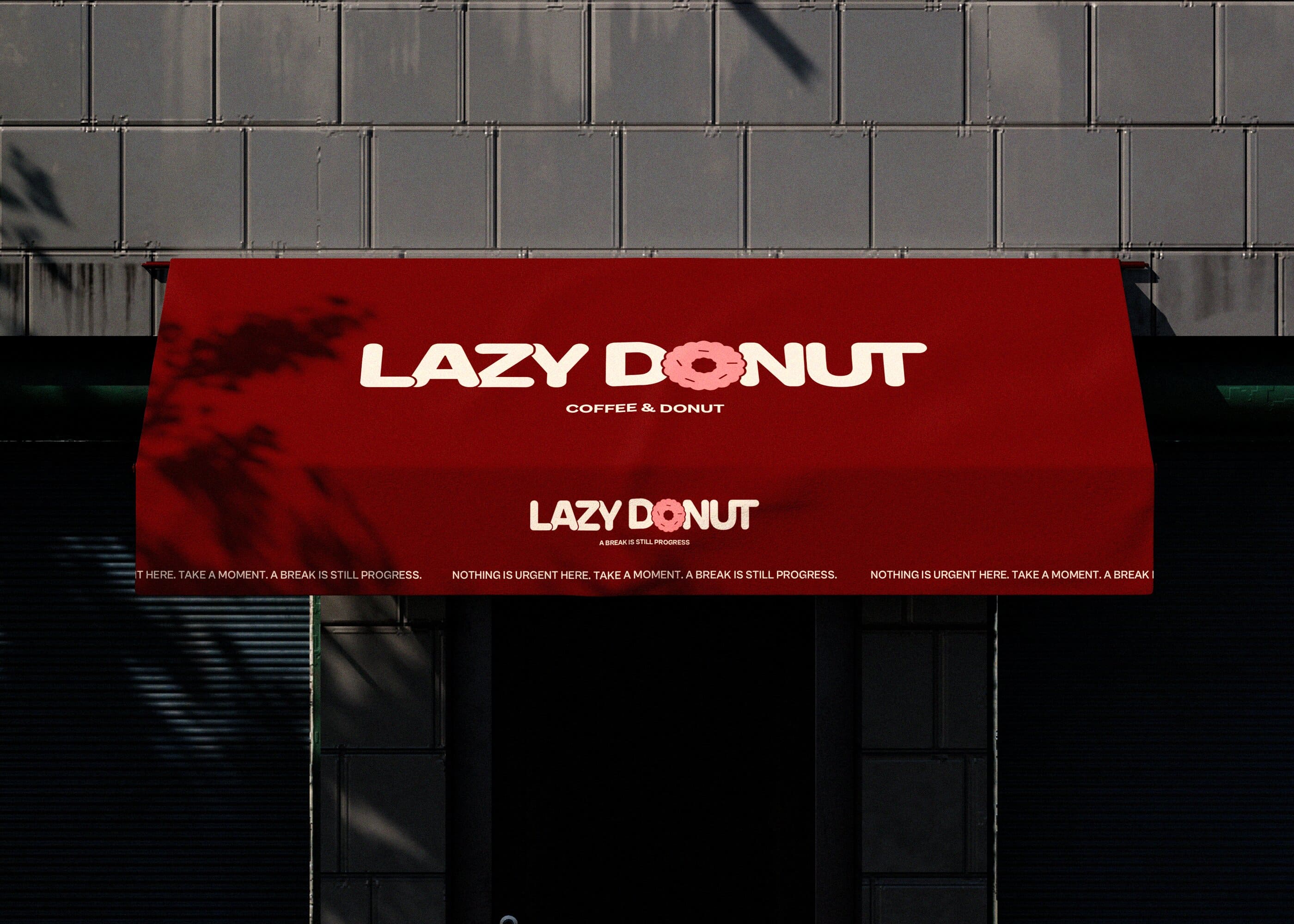
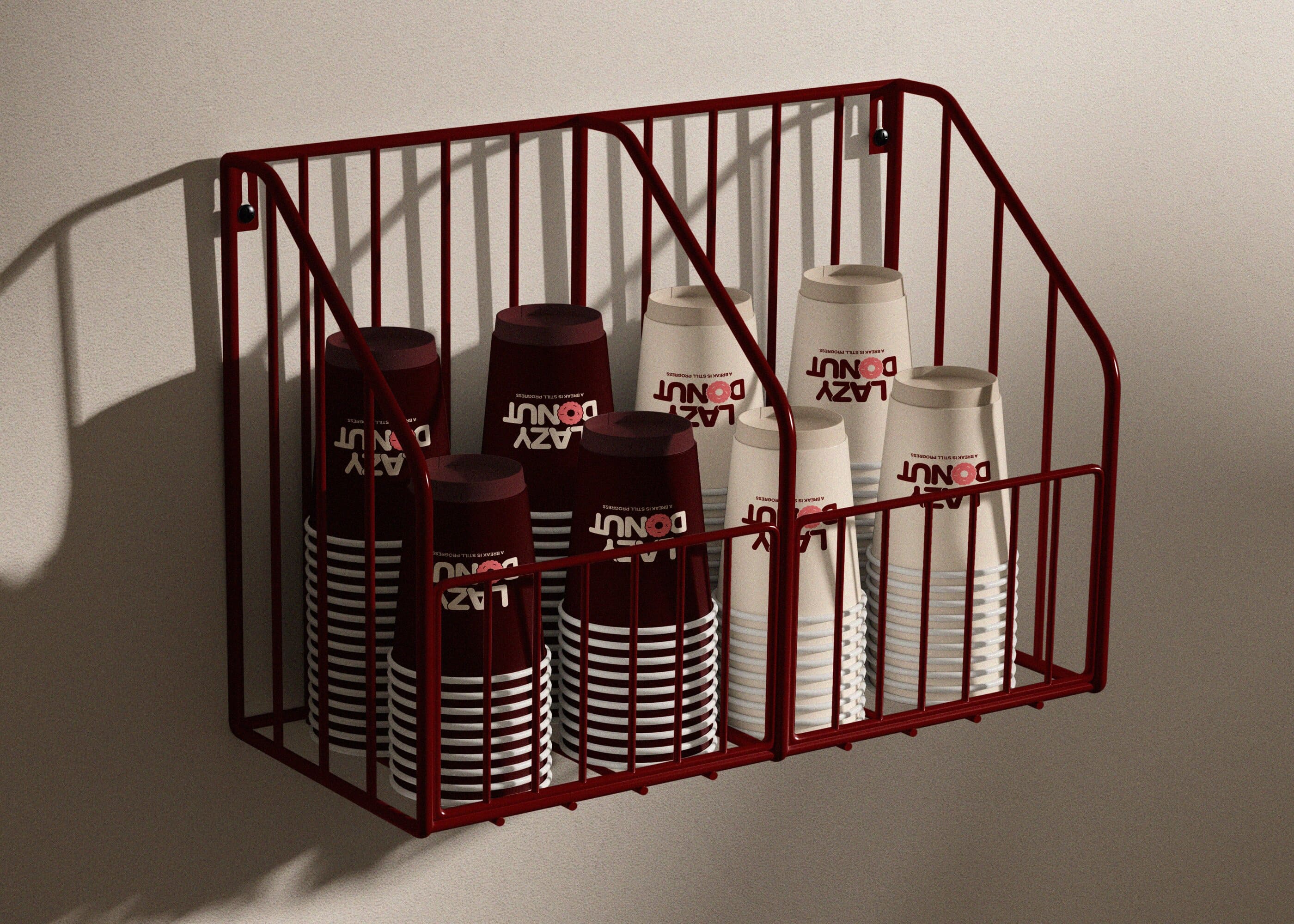
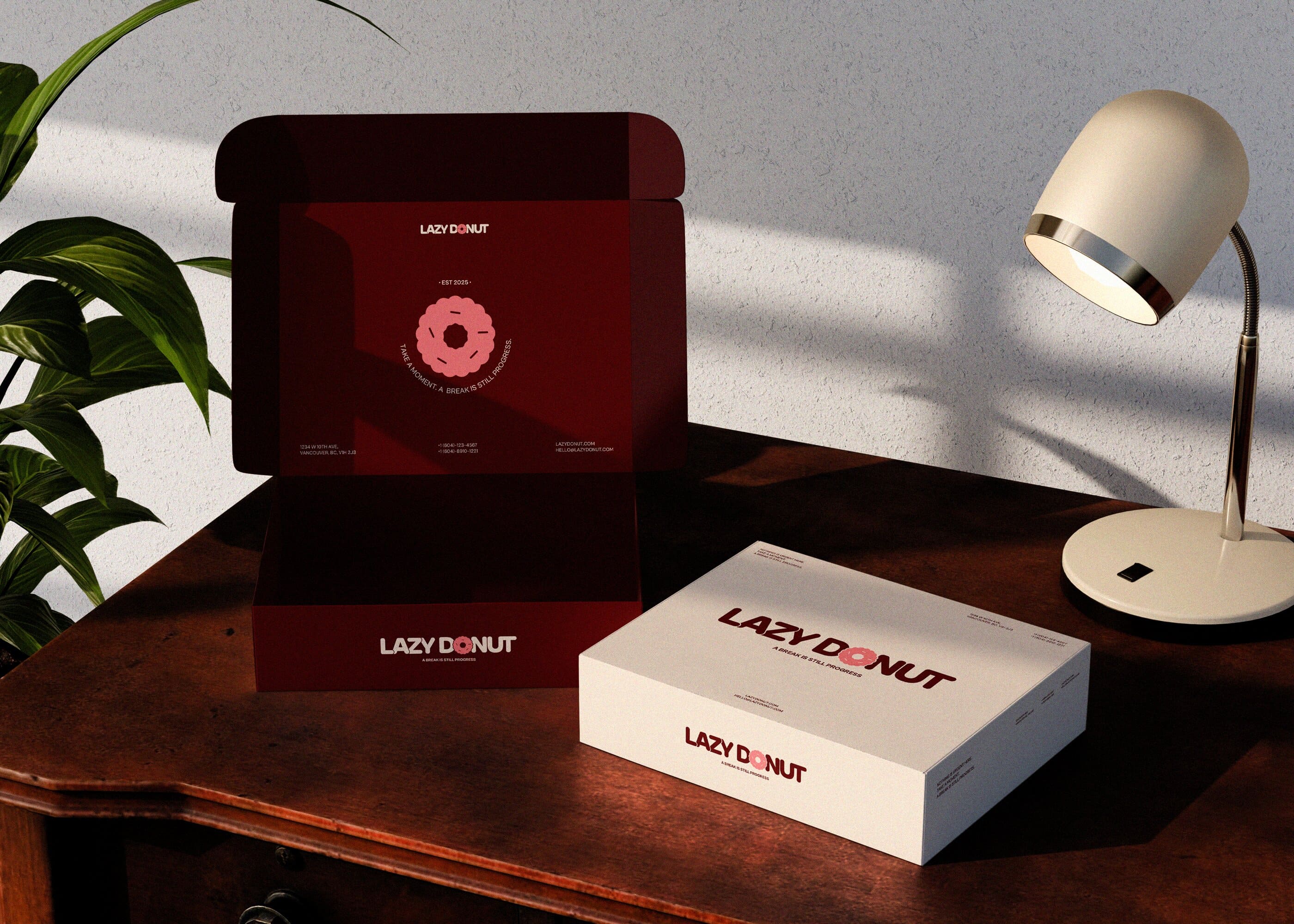
The final identity expresses “guilt-free rest between tasks” through gentle, accessible illustrations, a muted yet
contrasting colour palette, and clean sans-serif typography. Together, these elements create a contemporary and
approachable brand that communicates rest without urgency.
2026's Selected Case Study